Category: User Interface


Preference Panes and Catalina

August 28th, 2019 — 1:09pm

Apple announced numerous changes in Catalina in WWDC but there’s one that they failed to mention. System Preferences has had a major change: preference panes now load in a separate process. Apple ones get their own while all the third party ones get stuck in a process called “legacyLoader (System Preferences)”.

It’s becoming more common nowadays to split up programs into separate processes to isolate them from each other, usually done in the name of stability and security. The upshot of this to me is that all display and events happen via IPC between my pane and System Preferences. If done right, this should all be seamless and I shouldn’t notice a thing:

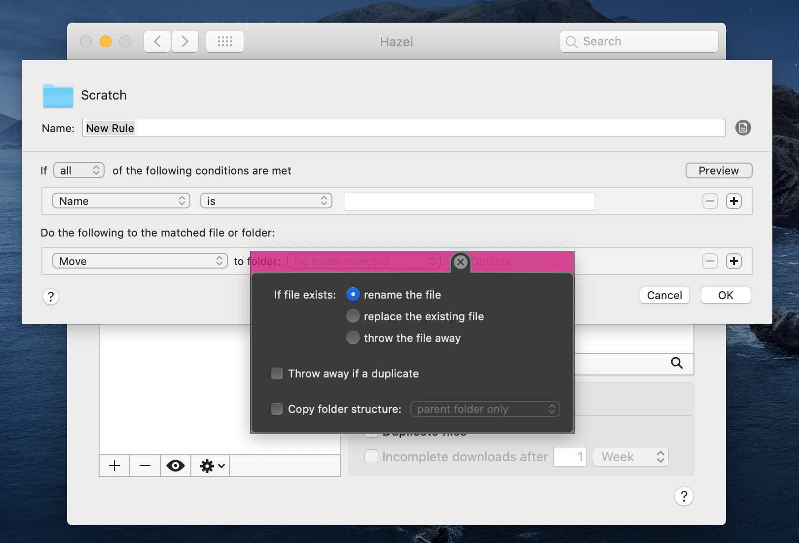
Window2

Of course, it’s never that simple.

First off, dark mode is broken. You can test this out by creating a blank preference pane in Xcode and loading that. For you Apple folks, that’s FB7076716. Interesting side note: problem doesn’t manifest itself if SIP is disabled.

The other problem is that magenta. What is that? Apparently, it’s a security feature. Any windows besides the main preference window will have their transparent areas colored magenta. I’ve been trying to pin down the rules as to when this occurs but it’s been slow going and also the screenshot above contradicts what I’ve been told. Note that my software is notarized so it’s not like this is only applying to unknown software.

To top this all off: none of this has been announced or documented. I’ve only found out about this through backchannels and then later, via a “conversation” via Feedback Assistant (FB6758586). It’s a big change and requires some major overhauls on my part. Aside from leaving things as they are, my options are to either rework my whole UI to avoid using any extra windows or convert my preference pane to an app. The latter is a long term goal but neither of those are realistic for doing over the summer between WWDC and Catalina’s launch. And mind you, that’s assuming they actually announced and documented this stuff up front (which they didn’t). How Hazel is going to look on Catalina is very much up in the air right now.

Maybe this will help other people writing pref panes as info on this is nowhere to be found (if I’m wrong on this, please send a link my way as I dying for any clarification on this). I don’t know how much of this Apple will fix as a good part of it is meant as a feature but one can hope that it will somehow sort itself out in the end.

Comment » | Hazel, OS X, Software, User Interface

ConnectionKit

July 10th, 2013 — 10:58am

In Hazel 3.1, I added the ability to upload files. Underneath the hood, I used ConnectionKit 2 to do the heavy lifting. It has an API similar to NSFileManager, making it very easy to add FTP, SFTP and WebDAV support without having to deal with the pesky details of those protocols. There were other factors on why I chose it, such as the fact that not only is it actively developed, but done so by people who use it in their own shipping commercial products. And it didn’t hurt that it’s maintained by my friends at Karelia.

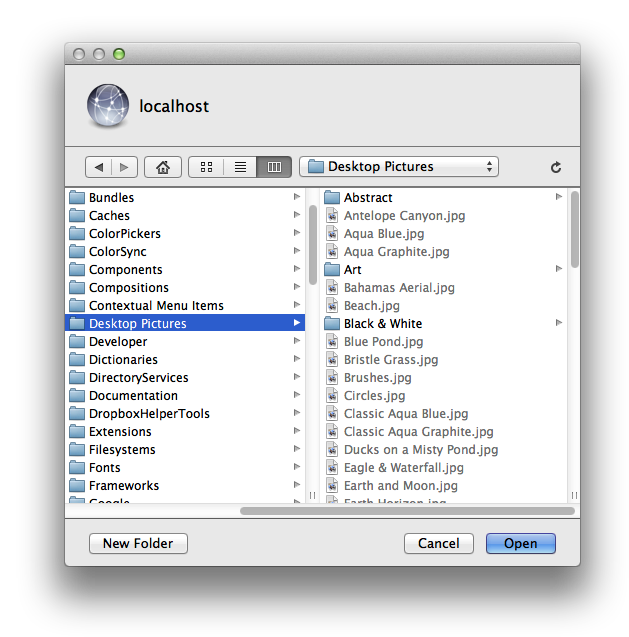
If you have used this feature in Hazel, you would have encountered this interface:

ckopenpanel1.png

It should look a bit familiar. It’s a homegrown, from scratch, implementation of NSOpenPanel made to work on top of ConnectionKit. I felt it important to provide a familiar interface instead of coming up with something new in this case. I did a bit of work to make sure it operated as closely to NSOpenPanel as was reasonable. It has multiple view types (icon, list, and column) and most of the controls you’d expect.

Of course, browsing a filesystem via various network protocols is a different beast so some things had to be done differently. The main thing is that the UI is asynchronous from the network stuff so no beachballing while waiting for responses from the server. The UI should be responsive at all times, even allowing you to cancel the panel at any point. In the upper right, there’s a reload button that changes to a progress indicator to indicate activity and you will see a loading message when trying to fetch the contents of directories that haven’t been loaded yet.

Visually, the biggest difference is the header up top noting which server is being browsed. Also, the sidebar is missing. There aren’t many standard locations that can be put there and I felt that favorite URLs should be managed elsewhere as it didn’t seem likely that users would want to hop from server to server by clicking different entries in the sidebar. The one common directory that I could think of was the home directory and so instead, I gave that its own button (note that not all servers/protocols have such a concept of a home directory and it also depends on what URL you use to connect to the server so YMMV).

Another omission is the search field. Since there’s no notion of Spotlight in any of these protocols, doing an exhaustive search of the remote filesystem would be resource intensive and not very friendly to the servers involved. While I may consider adding it back in to search the current directory, you can get much of the same effect by just typing out the name of the file. Just as in NSOpenPanel, it will end up selecting the entry starting with those characters. I also dropped the Arrange button and the Coverflow view, mainly because I didn’t think people actually used those things. Especially for Coverflow, it wouldn’t be particularly useful since we can’t get file previews without downloading the whole files themselves.

But besides all of that, I think you’ll find it to be a pretty decent facsimile of NSOpenPanel. You might be surprised by how much of NSOpenPanel’s behavior is replicated here, including some features many people don’t know that NSOpenPanel has.

And the resemblance is more than skin deep. CK2OpenPanel (the name of the NSOpenPanel implementation) has a nearly identical API to that of NSOpenPanel. It’s a mostly drop-in replacement for NSOpenPanel so programming to its API should be just as familiar. Why would you care? Well, you should care because I’ve contributed the code for CK2OpenPanel to be included in ConnectionKit. You can see all the code, warts and all. Play around with it. Use it in your own projects. Print it out and wallpaper your home with it. I felt it was the least I could do for all the work that’s been done on the backend. Also, I thought it would be nice if people adopted it so that there was a standard UI for this type of thing.

You can find everything on the ConnectionKit GitHub page. In particular, you want to check out the v2.x-beta branch. Note that there are separate targets/frameworks in the project for the back end (ConnectionKit) and front end (ConnectionKitUI), with the latter dependent on the former. Make sure to check out the README as it should answer a lot of your questions. And if you are interested in contributing to ConnectionKit, please do as there are a bunch of things that need work. S3 support would be nice, for instance.

Last but not least, a big thanks to Mike Abdullah at Karelia for working with me to provide the backend support for this. Rest assured that he will be receiving beers from me at the next conference we both attend.

Enjoy.

Comment » | Cocoa, Downloads, Hazel, OS X, Programming, Software, User Interface

Syntax Coloring For Fun And Profit

May 29th, 2012 — 9:32am

At the last NYC Cocoaheads meeting, I did a presentation entitled “Let’s Build a Text Editor: A Practical Introduction to the Cocoa Text System.” In it, I basically go through building a code editor from scratch, pointing out how to use the Cocoa text system along the way. I’m not going to reprise the whole thing here. The first part was an introduction to the basics of creating a document-based app and fitting the text system into that and the second part dealt with adding line numbering, which, if you’ve been paying attention at home, I covered here a while back. Instead, I’m going to focus on the third part, which is implementing syntax coloring.

One major aspect of syntax coloring is actually parsing the text. And guess what? I’m not going to cover that here either. There are books you should read on the topic. Like many people during their college years, I learned from the Dragon book though there are probably books more specific to parsing that you can find out there. Keep in mind, though, that you may not have to write as sophisticated a parser as you think. Sometimes, a lexical scanner is all that you need. Just parse the different elements you want to highlight (comments, strings, keywords, etc.) and ignore the syntactic structure. In some cases, this may be enough.

The focus of this article will be getting the Cocoa text system to do the coloring based on what your parser parses. Before we start, you should download the example project as this article refers to it throughout. I’ve created various snapshots at key points to show the progression. If you want, you can go through the various snapshots to see how the app was built up but for the purposes of this article, start at the snapshot called “Version 4”.

The Basic Approach

At the core of Cocoa text system is the NSTextStorage object. It stores the actual text as well as any formatting attributes. Being a subclass of NSMutableAttributedString, NSTextStorage allows you to apply different attributes to ranges of characters. For syntax highlighting, all we care about is the NSForegroundColorAttributeName attribute, which is the attribute that affects the font color.

If you look at the –parse: method in NoodleSyntaxHighlighter, you’ll see that it scans for C-style comments (/*...*/) and string literals ("..."). When it finds the range of a particular entity, it calls -addAttributes:range: on the NSTextStorage to annotate the characters with the appropriate color based on which entity we found. Note that this is how you modify any attributed string; it’s not specific to NSTextStorage. To make sure we keep up with the changes, we implement NSTextStorageDelegate protocol’s -textStorageDidProcessEditing: method. There’s an equivalent NSTextStorageDidProcessEditingNotification though I believe modifying the text storage is only allowed via the delegate method.

If you compile and run at this point, you’ll see that it pretty much works as advertised. We’re done, right? Not exactly. Try loading in a large-ish document. Around a couple thousand lines or so. Start typing really fast. It might depend on your machine, but you’ll find that the typing lags a bit. It seems that modifying the NSTextStorage is not quite as efficient as we’d like. Luckily, there’s a better way to do this.

Using Temporary Attributes

NSLayoutManager has a thing called temporary attributes. These are attributes just like attributes you use on an attributed string, except that they’re, well, temporary. They are more lightweight and designed specifically for cases like this, where the attributes are only used for display and aren’t something intrinsic to the document itself. It’s used for features like spellchecking and other places where you need to make temporary annotations to the text.

Imagine writing a rich text editor. You don’t want to make display-only changes to the NSTextStorage since those changes could end up being saved with the document. Sure, the code editor in this example doesn’t allow rich text but you can see where semantic division lies. The NSTextStorage is your “model” and you don’t want something like syntax highlighting, a “view” feature, to change the model.

In the example project, restore snapshot “Version 5”. This code isn’t much different. It’s adding attributes as before but instead of adding them to the NSTextStorage, they are added via the NSLayoutManager. Now, compile and run it and, if it wasn’t automatically restored from before, load up the large document you used earlier. You should find that it keeps up with your typing this time around.

Now you could stop here but I’d like to take it a step further. You have this nice parser and all. Surely, the ability to pick out different entities in the document is useful for more than just syntax coloring. Maybe you want to add more smarts to your editor. Maybe triple clicks will select the whole comment or string literal instead of just a paragraph/line. Maybe you want to know where code blocks begin and end for code folding. Or maybe you want special tool tips when hovering over different entities.

You can ask the layout manager for the temporary attributes at any character position. Just check for the color that’s set there and deduce which entity (comment or string) it is. Suppose, though, that the user can change the colors in the preferences. If entities are set to be the same color, this method won’t work.

Creating Your Own Custom Attributes

There’s nothing saying that you can’t create and add your own attributes to an attributed string. Sure, only ones defined by Cocoa will be used by the system for display but let’s decide for the moment to annotate our text semantically. Instead of setting the NSForegroundColorAttributeName, we set our own custom attribute to indicate the type of element we’ve found.

Restore snapshot “Version 6” in the example project. At the top of the NoodleSyntaxHighlighter implementation you’ll see that I’ve defined our own attribute (“noodleElementType”) and the two possible values (“comment” and “string”). The -parse: method is the same as before except instead of setting colors, we set our own custom attribute, marking regions of text as comments or strings.

That’s great but how do we get our colors? If you look at the NSLayoutManagerDelegate protocol, you’ll see a method called -layoutManager:shouldUseTemporaryAttributes:forDrawingToScreen:atCharacterIndex: effectiveRange:. What this method does is allow you to substitute different attributes for the ones that are there already. In our implementation, we check what element type we set during the parse phase, look up its color and return it as the NSForegroundColor. So, our NSTextStorage has semantic markup but when displayed, we can substitute in the proper display attributes to get it to color properly.

• • •

Now, there’s one thing I glossed over which is an obvious optimization. Notice how we re-parse the whole document on every change. When you get the text storage notification, you can query it for the range of characters that was changed via its -editedRange method. You can use this information to limit the range of the document you have to re-parse. What you can do is look at what element is there already (from your annotations from the last parse pass) and start parsing from the beginning of that element. You can even tighten it up further by limiting how far it has to parse. I leave implementing this as an exercise for the reader.

As you can see, doing the coloring part isn’t so bad though there are some slightly subtle details to keep in mind. The hard part is the parsing which I’ve conveniently (for myself) left for you to figure out on your own. Enjoy.

And in case you missed the link to the example project above: NoodleEdit.zip

2 comments » | Cocoa, OS X, Programming, User Interface

The Proper Care and Feeding of NSImage

April 15th, 2011 — 10:17am

[This was the topic of my presentation at the NYC Cocoaheads meeting last night. I thought it would be nice to also post on the topic here.]

[I’ve received email from Ken Ferry. See addendum at the bottom]

NSImage is a troublesome class. Over the years, it’s been misunderstood and abused. I think much of this is because of a lack of conceptual clarity in the docs and examples and the API itself can be confusing and misleading. Add to this having to mix with CGImage and CIImage and you can end up with a confused mess.

The way I like to think of NSImage is that it’s a semantic image. When you look at icons, they are made up of several versions at different resolutions. Technically, it’s 4 or 5 images but NSImage wraps those all up into one notion of an image. Semantically, it is an icon of, say, a house but underneath it’s made up of several actual images of a house. The main reason for these different versions is that some graphics do not scale well and it helps to have hand tuned versions, especially for the smaller sizes. You can also do things like omit certain features in the smaller sizes to simplify the graphics and make the icon more recognizable.

One key misunderstanding is the notion that NSImage has actual image data. While there are parts of the API that deal with a cached bitmap (more on this below), NSImage itself is not based on image data. It is best to think of NSImage as a mediator between the image data in the various representations and the drawing context.
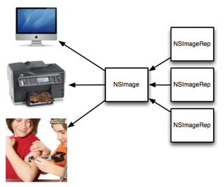
Structure3

Loading an image from a file and drawing it is usually straightforward. If there are multiple representations, NSImage will figure out the correct one to use when drawing it. Most of this is automatic and is an important key to understanding how to use NSImage. As you will see further on, bypassing this mechanism leads to many issues with size and resolution mismatches when processing NSImages.

I’ve created a little program to help illustrate the points in this article. Since it also includes a new reusable class, I’ve included it in my NoodleKit repo. I suggest checking it out. Just compile and run the ImageLab target (you may need to set the active executable in XCode in the project menu). The rest of this article will be referring to it so I recommend you run it while reading the rest.

When you launch the app, it will load the test image. It’s just a colored circle. Now resize the window. You’ll see that the color changes as you resize. The icon itself is made up of four different sized images and to make it clear which representation is being used, I made the circle different colors for each one. Whenever the color changes when you resize, NSImage is switching to a different representation based on the size. Here’s what the different reps look like in Preview:
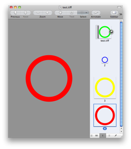
original

Size is another confusing aspect of NSImage. One thing to remember is that size is not pixels. It represents a coordinate space. One way to think of it is that NSImage’s size is like NSView’s frame while NSImageRep’s size is like NSView’s bounds. For NSImage, its size is a suggested size to draw the image in the user coordinate space. If possible, it’s best to explicitly specify the destination rect.

Let’s take the case of drawing some custom graphics on top of an existing icon with several representations, like drawing a badge over your app icon. A common way to do this is to lock focus on the NSImage, do your drawing, unlock focus and then draw the resulting image. What -lockFocus actually does is allow you to draw into a cache. This has probably lead to a lot of the misunderstanding that NSImage holds image data. Unfortunately, there are issues with this approach. Mainly, because there is no context about where this image will be drawn so the resulting image is tied to a specific resolution. Also, you are editing a cache so none of this image data is reflected in the original image reps and actually, from poking around, it’s actually destructive in that it may end up removing any other representations.

In our case here we are modifying an icon with different sized representations, what we end up doing is locking the resulting image into the size that happened to be set on the original NSImage. In many cases, you may not know how and where this icon will be used but if any scaling is involved, you may end up having an icon with the wrong version being displayed. In the example program, select “Modified (lock focus)” in the pop-up. Here it picks the 64×64 version (as indicated by the green circle) which becomes a problem when you scale the image up as shown on the left in the image below.

lockFocus

The one on the right is a version which uses an  NSImageRep subclass (select “Modified (custom image rep)” in the pop-up). Notice that it picks the appropriate size as you resize the window. Why is this the case? It’s because NSImage doesn’t ask the image rep to draw until the NSImage itself is drawn. At that point, you actually have information about the destination, including how big it will actually appear on screen. NSImage is able to use this context to determine the right match between different sized images and the resolution of the output context. The same goes for any drawing code.

Subclassing NSImageRep is quite easy; you just need to override the -draw method. I’ve made it even easier by providing NoodleCustomImageRep which takes a block, allowing you to create images without creating a new subclass.

Say, though, you are drawing an image that should scale without pixellation, like drawing a square. Surely, you can just lock focus on an NSImage and draw a square and scale that as needed? Well, Mr Smarty Pants, take a look at the example program. Select “Drawn (lock focus)” in the pop-up.

square


Here, you’ll see odd fuzziness around the edges. What’s going on here? It’s not anti-aliasing but instead the graphics context where the image is being drawn has image interpolation turned on. As a result, the AppKit is trying to interpolate the image from it’s original size to a much bigger size.

How do you fix this? You could try turning off image interpolation in the destination graphics context but this isn’t always possible or desirable. The better solution is just like before: use a custom image rep to do the drawing (select “Drawn (custom image rep)” from the pop-up). Since the drawing occurs at drawing time, instead of image creation time, it knows about the context it is drawing into and therefore can provide your drawing code with a context at the correct resolution. The crisp square on the right speaks for itself.

Let’s take another example. Say we want to take an existing image and run a Core Image filter on it. Somehow you have to convert your NSImage into a CIImage. This usually entails a game of connecting up various methods that fit together until you got a CIImage. A common way to do this is:

ciImage = [CIImage imageWithData:[nsImage TIFFRepresentation]];

This dumps the whole image (all of its representations) into TIFF format which is in turn, re-parsed back into data. Now, CIImage is pixel based so it ends up picking one of the representations. It’s not documented which representation is picked since there’s no way to specify the context where it will be drawn so there’s a chance it won’t be the right one. Select “Core Image (TIFF Rep)” in the pop-up and you get something like the image on the left (or maybe you won’t; read on):

coreImage

Now, it doesn’t look too bad here. It took the highest res representation and used that. That said, technically, it’s not correct. The version on the right (select “Core Image (custom rep)”) shows the correct image rep being used. Also, my experience has shown that the representation chosen by the -imageWithData: method can be different on different hardware and that it ignores the size set on the original NSImage so you may not be so lucky depending on what machine your code runs on.

Fortunately, Snow Leopard introduced a new method: -CGImageForProposedRect:context:hints:. As mentioned before, when you draw an NSImage into a context, it will automatically pick the right representation for that context. This method does basically the same thing but without the drawing part. Instead it returns a CGImage which you can then use to create your CIImage:

cgImage = [nsImage CGImageForProposedRect:&rect context:[NSGraphicsContext currentContext] hints:nil];
ciImage = [CIImage imageWithCGImage:cgImage];

Keep in mind, though, that it the image returned might not be the exact size you wanted. This becomes more of an issue when you are combining multiple images together in a CIImage pipeline and you need them all to be the same size. You can adjust for this by using CIImage’s -imageByApplyingTransform:.

In addition to the above method, Snow Leopard introduced -bestRepresentationForRect:context:hints: which does a similar thing but returns an image rep instead. Depending on your needs, you can use one or the other to tap NSImage’s image matching logic.

Finally, a note about performance. NSImage does keep a cache based on the drawing context. This helps for when you repeatedly draw the same image at the same size over and over. If you end up sharing an NSImage across different contexts, you’ll find that you are defeating the cache. For these cases, you should be copying the NSImages. Remember that NSImages are just mediators between image data and drawing context. NSImageReps are the actual image sources and, starting with 10.6, reps like NSBitmapImageRep do copy-on-write making it inexpensive to copy NSImages and their reps.

In the example app, there’s a field which shows the time taken to display the image. You’ll notice that when you resize the window, the cases which use a custom image rep are slower as it has to recache whereas the lockFocus cases don’t since the image is static. If this becomes an issue, you can turn off caching or use a fixed resolution image during a live resize. Another more subtle piece of business is performance when drawing from the cache. If you click the “Redisplay” button, it will cause the image to be displayed again. Since you aren’t changing the size, the cached version can be used. Notice how the versions using the custom image rep are usually a smidgen faster than the lockFocus versions. I suspect what is happening is when you lockFocus on the image, you lock the cache into a specific version and size. As a result, if you are drawing at any other size, it has to scale the cached image every time. With a custom image rep, it’s cached at the exact size so the cache can be used as is.

What are the lessons here?

  1. When defining your image, you should use an NSImageRep subclass and override -draw. If you don’t want to create a whole subclass just to create an image, use my NoodleCustomImageRep (included in NoodleKit) which allows you to pass in a drawing block. Using an image rep gives your drawing code better contextual information than you would get just drawing in a -lockFocus.
  2. If you follow point #1, then you can let NSImage make the decision of which representation to use. Use  one of the drawing methods, -CGImageForProposeRect:... or -bestRepresentationForRect:... and you’ll get the best sized representation for the job. Do not assume, though, that this representation will be the actual size you want. When drawing, it also helps to specify the rect to draw into.
  3. Avoid using -lockFocus. It doesn’t produce the correct image in different contexts and can be destructive in terms of kicking out the other reps in the NSImage. While still ok in specific circumstances, you have to know what you are doing.
  4. If using the same NSImage in different contexts, copy it. In 10.6 onwards, this is an inexpensive operation as bitmap data is copy-on-write. Copying NSImages is is also a good idea in case some decides to use -lockFocus on the image (see #3).

If you have access to it, I highly recommend watching the video for Ken Ferry’s session at WWDC 2009: Session 111: NSImage in Snow Leopard (you may need a developer account to view/download it). Much of this is derived from that presentation and it has even more interesting bits about NSImage than what I’ve presented here.

And in case you missed it above, you can find NoodleKit (which contains NoodleCustomImageRep as well as the example program) here.

Addendum (Apr. 18, 2011):

I received an email from Ken Ferry himself pointing out a couple things. Mainly, that as of 10.6, lock focusing doesn’t draw into the cache anymore. It creates a representation whose context is suited for the main display. It is still good for images which are meant for that context. Also as the NSImage context will maintain any size-to-pixel ratio that is on the main display, it can still be used in this situation should resolution independence come into play. It’s not much different than before in this respect but it’s not as volatile as a cache, which I believe is the key point here.

That said, all the caveats above about using -lockFocus still hold true. It’s not so great for when the image needs to be scaled or if you have representations you want to keep (it does remove all other reps when you lock focus). Also, because the representation is tied to the machine, it’s not very suitable for persisting.
Comment » | Cocoa, Downloads, Icons, OS X, Programming, Quartz, User Interface

Yet Another Way to Mimic the Artwork Column in Cocoa

October 20th, 2009 — 8:14pm

I was just turned on to a post from Jesper of Waffle Software entitled How to Mimic the Artwork Column in Cocoa. There he approaches the problem of implementing cells in an NSTableView that can span multiple rows. This spurred on Jacob Xiao at Like Thought to tackle the problem in a different manner. I suggest reading both of the above to get a sense of the problem and the possible approaches.

With NSTableView still on my mind from my last diversion, this got me thinking about the problem and I decided to try my own hand at it. I preferred Jacob’s approach as I think it should be all contained within NSTableView if at all possible. I liked the notion of “slicing” up the cell instead of using another view. Playing with it, I came up with a generalized solution. Here are some of the interesting aspects:

  • It can support any NSCell subclass. I do this by using a special wrapper cell. It draws the “full” version of the cell then draws out the slices for each row into the tableview.
  • It determines the spans by finding contiguous rows that have the same object value for the column in question.
  • The above two points are exploited to do some caching such that the “full” cell is only drawn once and the parts composited in place as needed.
  • If the first column is set to span rows, it will only draw the grid for the last row in a span.
  • You can designate multiple columns to do this. In the example project, if you click on the “Album” column, it will toggle between span and non-span mode. The “Artwork” column doesn’t do this because it looks cruddy in non-span mode. I haven’t tested it (see update below) but theoretically, the spans do not have to line up between different columns.

To use it, for any columns you want to have this row-spanning behavior, set the table column class to NoodleRowSpanningTableColumn. Also, it might help to get rid of any intercell spacing in your tableview (at least in the vertical direction). There are probably a few bugs. I do know that reordering columns may cause some grid drawing funniness but for the most part, it seems to work pretty well. Let me know if you find otherwise.

You can check the code for other implementation tidbits. I’ve included a self-contained project below but I’ll eventually polish it a bit and add it to my NoodleKit repository where it can join the rest of my goodies.

Many thanks for Jesper and Jacob for the inspiration and laying down the groundwork for this.

Update (Oct. 21, 2009): I observed odd behavior in that the program would get into a re-drawing frenzy eating up a bit of CPU. This was non-blocking in that I was still able to manipulate the UI (which is why I didn’t notice it at first). I finally figured out that it was the -drawGridInClipRect implementation. I was drawing the grid selectively by changing the grid mask and then calling super on subregions. Unfortunately, changing the grid mask queued up a redraw which started a loop (albeit one that didn’t tie up the event loop). Seeing as I needed to fix the grid-drawing logic anyways, I reworked the whole thing.

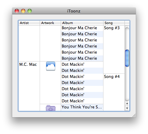
The new grid code should now be able to handle multiple spanning columns rearranged in whatever way you want. Here’s contrived example of having multiple spanning columns that don’t necessarily line up:

row-spanning-table.png

I also made some other fixes and improvements so it’s worth re-downloading the project even if you already did so before (I bumped this version to 0.37).

As for integration with the rest of NoodleKit, I still need to decide whether I want to merge this with my sticky row tableview to make some über-tableview. Problem is is that I can’t think of how the two features would interact so maybe it’s best to keep them separate. Thoughts on this are welcome.

Update (Oct. 23, 2009): I’ve just updated the project to version 0.68. There was a crasher when you would click on a non-span row and then move into a spanning cell. Also, the span cells were highlighting when you clicked on a non-span row. Both of these have been fixed. Thanks for Jesper for finding the crasher and Jacob for helping with the fix.

Update (Oct. 25, 2009): I’ve consolidated this functionality along with my previous sticky row header code into a single NoodleTableView class. You can find it in the NoodleKit repository. Future updates to this will be posted there from here on out.

Download NoodleRowSpanningTableViewTest.zip
[This project is no longer being updated here. You can get the latest in the NoodleKit repo]

2 comments » | Cocoa, Downloads, OS X, Programming, Software, User Interface

NoodleKit

September 29th, 2009 — 2:44pm

I’ve finally gotten around to consolidating most of the bits of code I’ve posted on this blog over the years and put it in a repository. While the real NoodleKit is a much more extensive and cohesive toolkit that I use internally, this one will serve as a place where I put the odd scraps that I decide to open source. I guess I could’ve called it NoodleScraps but it doesn’t quite sound as nice.

If you’ve been following my blog for a while then there’s not much new here, codewise. There are a tweaks here and there plus the stuff should be 64-bit ready so it might be worth re-downloading just for that. It will be the place where I put future code so you should keep an eye on it.

The project is structured to build a framework but also has an examples directory (with corresponding targets) to demonstrate the use of the different classes. The current notion is to keep things compatible with 10.5. And, as usual, all code is released under the MIT license.

NoodleKit (hosted at github)

Enjoy.

Comment » | Cocoa, Downloads, OS X, Programming, Quartz, User Interface, Xcode

“Sticky” section headers in NSTableView

September 25th, 2009 — 9:25am

Once again, I find myself with some cool code with nowhere to put it. And, yet once again, you get the reap the benefits.

UITableView on the iPhone has the neat feature where section headers stick at the top after the actual row for it has scrolled off. For instance, in Contacts, if you scroll down, the row for section “A” stays visible so that you know what section you’re in if the section is too large for the screen.

Unfortunately, someone asked how something like this could be done on desktop Cocoa. I say “unfortunately” because I was within earshot and it resulted in me embarking on a journey peppered with annoying run-ins with NSTableView’s idiosyncrasies. Nonetheless, I persevered and came up with something hopefully someone will find useful. As was the case before, I don’t have a use for it myself at the moment, but I feel it would be a shame to let the code go to waste.

I am presenting NoodleStickyRowTableView. I call the section headers “sticky rows” as one can specify any row to stick up top for whatever reason, though by default, it does it for group rows.

The bad stuff:

NSTableView makes it very difficult to cache a row visually. -drawRow:clipRect: should be able to do it but the problem is that it’s too smart for it’s own good. If the row is not visible, it will not draw anything. Add on top of that the impossibility of getting it to draw the special background the group rows use. I tried all sorts of techniques but none were general or reliable enough. My email on the cocoa-dev list was, not surprisingly, ignored. As a result, in the default implementation, I use my own look for the rows and then use a fade-in transition since the sticky row will look different from the actual one. You can see it in the video below where it has a ghost-like effect.

The good stuff:

The good news is that I managed to work it into an NSTableView category. You can think of it as an abstract category if you wish. In your subclass, at the very minimum, override -drawRect: and call -drawStickyRowHeader after calling super. From that one call you will get all the functionality.

Why do it this way? Well, ease of use for one. It makes it so that you can integrate it into your own NSTableView subclass without having to copy and paste large swaths of code or put it all sorts of odd hooks. Secondly, the changes get inherited by NSOutlineView so the functionality is available there and in its subclasses as well.

While I could use the new associated objects functionality in Snow Leopard, I opted for Leopard-compatiblity. This resulted in me coming up with a couple tricks to get around the lack of ivars, including the rarely used -viewWithTag: method. Check the “read me” file and code for details.

There are two different transitions. The default is the fade-in transition as shown here:


<a href="https://www.noodlesoft.com/blog/uploads/2009/09/Ghost-Transition.mov">Download movie</a>

As mentioned before, since I couldn’t get the group rows to draw properly and consistently, I use a more generic look for the row. The transition makes it less jarring but it is a compromise of sorts. Not bad when you consider that you get all this by calling just one extra method in your -drawRect:.

But what if you want something more like the iPhone’s version? In your subclass, you can override -stickyRowHeaderTransition to return no transition and then do your own drawing of the rows so that they look the same between the regular and sticky versions. The NoodleIPhoneTableView included in the project shows how this is done with the result being something on par with UITableView:


<a href="https://www.noodlesoft.com/blog/uploads/2009/09/iPhone-Transition1.mov" title="iPhone Transition.mov">Download movie</a>

I am releasing this under MIT license as usual. Use it however you want as long as you give me credit somewhere. Please send in any feedback, suggestions, bugs, etc but keep in mind that this is not something I use in my projects so I probably will not be actively maintaining it beyond a certain point. I’ve made a point of making the the API easy to use and to extend so have fun with it.

Download NoodleStickyRowTableViewTest.zip (version 0.18639)

Update (Sep. 29, 2009): I have included this class in my NoodleKit repository so you should check there for future updates.

4 comments » | Cocoa, Downloads, OS X, Programming, User Interface

The Invisible Interface: Stealing Prefs

January 27th, 2009 — 1:52pm

In this installment of The Invisible Interface, we are going to look at stealing preferences. What is stealing preferences? Simply enough, it’s using the preferences of some other app instead of having your own for a particular feature. The point of this is to avoid having to provide a separate interface for settings when the user has already made their choices known somewhere else.

The key here is finding cases where your functionality is more centrally used somewhere else. I’m going to use Hazel as an example but hopefully these will illustrate the point well enough for you to look for where you can apply it yourself.

Spring-Loaded Folders

For those that don’t know, Finder has a feature called spring-loaded folders. What this does is when you drag a file over a folder, after a delay, it will flash and then open that folder so you can drill deeper. It allows you to navigate the folder tree without having to let go of the file you are dragging.

Hazel implements spring-loaded folders as well. It works when you want to move/copy rules in between folders. Hovering the dragged rule over a folder in the list on the left will cause the view to switch to the rules for the hovered-over folder allowing you to drag back into the rule list and place the rule where you want it. [On a side note, implementing this uncovered a bug in NSTableView (at least on Tiger; have not checked with Leopard) resulting in me doing my own implementation of NSTableView’s drag and drop.]

Under Finder’s “General” tab, you’ll see a checkbox and slider to configure these settings. Your first thought may be to provide a similar UI in your app. But why? Does the user really care about tweaking this for each app it appears in? It seems like whatever setting works in Finder will be fine wherever else it is used so why not just use Finder’s preference?

Commonly Used Folders

In Hazel, when you specify a destination folder for some actions (like move and copy), there is a pop-up of folders. You’ll notice that there’s a list of common folders at the end of the pop-up menu. If you look a bit closer, you may notice that these are the same folders in the sidebar of your Finder windows. Those folders are common destinations for files so it’s a good list for Hazel to use. By grabbing that list from Finder, Hazel avoids any sort of extra maintenance/interface for managing that list.

AppleScript Editor

In 2.2, Hazel introduced inline editing of scripts. You are provided with a mini-AppleScript editor right in Hazel’s rule interface. Now, there are potentially different things you can tweak to make the editor suit your needs, such as line wrapping, tab widths and whether to use the script assistant. But if you poke around Hazel’s UI, you’ll see that there’s no interface to set these. That’s because Hazel steals these preferences from Script Editor. If someone is serious enough about editing AppleScript that they care about these settings, there’s a good chance they have Script Editor installed and already set these preferences. By using its preferences, there is a consistency of user experience between the two editors.

• • •

Of course, you can’t do this everywhere. It’s best suited when the functionality is primarily used elsewhere and you are echoing it in your own app. The apps Apple ships with the system are an easy mark since you can usually rely on them being installed and they tend to be the places where common functionality is defined. Overall, the result is a less tweaky and cluttered interface and a more seamless experience with the rest of the system.

Doing the Heist

You can grab other apps’ preferences using either CoreFoundation or Cocoa. With Cocoa, NSUserDefaults is your go-to guy. -persistentDomainForName: does what you want. Give it a bundle ID and in return, you get a dictionary of preferences. What would’ve made more sense is something like +userDefaultsForName: which would return an NSUserDefaults instance, but hey, it’s not like Apple is hiring me to do API design. With CoreFoundation, you can use CFPreferencesCopyAppValue() to pick individual preferences. Again, a bundle ID is needed.

And I can’t leave without placating the more pedantic among you that have to point out the potential dangers of doing this. Therefore, I must note that there is some risk in doing this as most apps do not document their preference settings and they can change at any time. Having default values of your own for these settings should minimize the risk, at least buying you time until you can re-work things to use the new schema. That said, if this is for some critical/primary functionality in your app, it might behoove you to have your own settings for it. As they say, invest only what you can afford to lose, or, to milk the stealing metaphor, don’t do the crime if you can’t do the time. And while we’re at it, just say “no” to drugs, kids.

Comment » | Cocoa, Hazel, OS X, Programming, User Interface

Positional Sound in User Interfaces

October 23rd, 2008 — 3:50pm

Video games are on the forefront of what kinds of rich interactions people can have with computers. In the past decade, there’s been a push for more and more immersive virtual environments resulting in more advanced APIs and hardware to provide things such as super-fast 3D rendering. In recent years, OS X has leveraged these advances in the predominantly 2D world of user interfaces, often in brilliant ways as seen with QuartzGL, CoreAnimation and CoreImage.

In video games, it’s quite common to exploit stereo output or even better, surround sound, to provide positional audio cues. Just as graphics can simulate a 3D space, so can sounds be placed positionally in the same space. If you, super-genetically-modified-mutant-soldier, are running around on the virtual battlefield and there is some big-bad-alien-Nazi-demon-zombie dude shooting at you from the side, you will hear it coming from that direction and react accordingly. Directional audio cues can supplement visual cues or even supplant them if visual ones cannot be shown (i.e. something requiring attention outside your field of view).

On OS X, sound is used rather sparingly in the interface, which is probably a good thing. But for those cases where it’s use is warranted, why not take advantage of technology available? Just as animation can be used to guide the user’s focus, why not sound? OS X does ship with OpenAL, which is to sound what OpenGL is to graphics, providing a way to render sounds in a 3D space.

I’ve put together a quick proof of concept app (download link near the end of the article). Move the window around the screen and click the button to make a sound. Based on the window’s position, the sound will appear to come from the different sides, which, for the most part is left/right, most sound output systems not being designed to articulate things in the up/down direction. The program itself basically maps the window position to a point in the 3D sound space. Right now, it doesn’t really use the z-axis (the axis that goes into your screen) but conceivably you can do things like make the sound appear further away based on window ordering. Try using headphones if the effect is not as apparent using speakers.

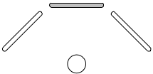
There is a significant technical issue, though. You can’t really know the actual physical dimensions and layout of a user’s screens. In addition, the position of the speakers relative to the screens is also not known. While you can get screen resolutions and relative positions of the screens, these are mostly hints at the actual layout. In my demo program, it is assumed that the screens are relatively close to each other forming one gigantic screen. It is also assumed that the speakers produce a soundstage roughly centered on the primary display (the one with the menubar). It assumes a model like this (the circle is the user and the thin slabs are the monitors, from a top-down view):

screen-setup1.png

In reality, it’s probably more likely the user would have a setup like the following:

screen-setup2.png

But who knows, it could possibly be something like this:

screen-setup3.png

The point here is that the effectiveness of this is dependent on the user’s setup. A particular idealized model would have to be chosen that hopefully works well enough for most people. While pinpoint accuracy is not really feasible, it probably isn’t required either. Human hearing is imprecise, otherwise ventriloquists would never be able to pick up a paycheck. Just an indication of left, right or center is probably enough for these purposes.

Where would this be useful? Well, this all came up yesterday when I received an IM (via Adium). I had my IM windows split up across two screens so I had to scan around a bit to find out which window had the new message. Though the window was on the screen to the left, the audio alert made me look at the main screen since the sound was centered straight ahead. It would be great to see an idea like this implemented in Adium and I’ve filed a feature request with them for their consideration. It’s ticket #11292 so you don’t go and submit a duplicate request.

It would be interesting to see more use of this in user interfaces out there. I don’t want to encourage people to add sounds to their apps if they weren’t already using them but for those that are, it’s something to consider. Overall, the effect is quite subtle but with some tweaking, it can be quite effective.

The link to download the demo program is below. Sorry, no source is provided this time. The code is a hacked together mess of stuff copied and pasted from an Apple example as I have never used OpenAL before. This can probably also be implemented in CoreAudio by adjusting the balance between the channels. If you are considering implementing something like this, email me and I’d be happy to discuss details as long as they don’t involve audio APIs since, well, I don’t know them particularly well.

Download PositionalAudioAlertTest.zip (Leopard only)

Thanks to Mike Ashe and Chris Liscio for advice on CoreAudio, which I ended up not needing as Daniel Jalkut suggested I use OpenAL instead which made things easier.

5 comments » | Downloads, OS X, Software, User Interface

The Invisible Interface

September 29th, 2008 — 1:22pm

This is something that I’ve thought about for some time so I thought I’d write a series on the topic of invisible interfaces. What is the invisible interface? When people think of a user interface, they think of something visual made up of windows and widgets. Even for a commandline program, it’s the arguments, the output and error messages. But what many people aren’t aware of are the choices the designer made and the logic the programmer codes that make decisions for you. An interface not only encompasses what the developer put into it, but also what the programmer specifically kept out. This benefits the user in a number of ways: a less cluttered interface, a simpler interaction paradigm and fewer steps to accomplish a task. Many of these things are too subtle to be noticed normally which is the beauty of it. Sometimes the best interface is the one you never know is there.

Let’s take for example the flush toilet. Yes, sorry if this example is a bit disgusting but I’ll try and keep it clean and it is a fitting example. Just bear with me here. So, where were we? Ah yes, the toilet. Simple interface. Push down on the lever, water is flushed down and it stops and refills the tank ready for the next flush. It doesn’t get much simpler than that (well, it can but more on that below). Notice how you don’t have to stop the flush. If the toilet is calibrated properly, it should have enough water to flush down whatever you may put in there.

Of course, from a performance/efficiency standpoint, it’s not optimal. You are flushing the same amount of water each time, whether there is liquid or solid matter to be disposed of. How does one work this new requirement (the need to save water) into the interface? In Europe (I have yet to see them stateside), there are toilets with a split button. Hit one side and a lesser amount of water is flushed whereas hitting the other side flushes down a full measure. There are usually markings to indicate 1 or 2 (one or two dots is what I’ve seen) so you can figure out which one is which. Now, the interface has become more complicated. Yes, in the grand scheme of things, it’s not rocket science, but humor me. Now a decision has been added. Do I hit the 1 or 2 button? The user is now required to give the device more information than they had to before. The question is, is complicating the interface worth the functional gain and also, is there a way to effect the same result without changing the interface at all?

How about auto-detecting the amount of water needed? Not only does this optimize the efficiency of the device, it also takes away a decision. Now, of course, whether this can be practically done is in question. It is unclear whether the technology to do this reliably exists and there are also issues of manufacturing, cost and maintenance that play into it. But the point is that from a pure interface standpoint, it would seem to be a better solution. It meets the new requirement while retaining the one button simplicity from before.

And to take it even further, it could sense when a flush is needed, alleviating the need of the button altogether. While these types of toilets are becoming more common in public restrooms, I haven’t heard of any demand for these in the home. Here, it’s possible that automatically doing something on the user’s behalf becomes unwelcome. I can imagine in your smaller bathroom at home, you are likely to trigger it accidentally by walking by it which can be startling. In a public setting, you probably don’t care if toilets are firing off left and right like the cannons in the 1812 Overture. On one hand, it could be just an issue of implementation; maybe the technology just isn’t accurate enough. On the other hand, it’s very possible that this is a feature (when to flush) that the user wants control over. Either way, it’s an issue that the designer must grapple with.

The point of all this is that there is some room for improvement in terms of simplifying interfaces when one strives to have their program/device do more for the user. The more your program does, the less the user has to. But one can also overstep their bounds to create something that may be seen as intrusive. It’s about defining the balance between what the user does and what the machine does, with an eye towards putting more on the machine’s side.

As I mentioned in the beginning, I’m intending this to be the start of a series. Don’t expect some well-thought out arc with this; it will probably just be an occasional article here and there. While part of me wouldn’t mind writing more about toilets (I haven’t even touched upon those wacky Japanese toilets1), in the next installments, I’ll try and come up with examples more relevant to computer/human interaction.


1: warning: linked page features bare asses

7 comments » | User Interface

Back to top